The Colour of Magic: Grading Sci-Fi and Fantasy World
Some of the industry’s top colour graders break down some of their favourite projects depicting world that are far from our own reality.

With the success of the likes of ‘The House of the Dragon’ and ‘Dune’, sci-fi and fantasy are finding mainstream audiences in culture right now. For colourists, these otherworldly genres are a chance to let loose and play, creating vivid colourscapes or playing with gritty, grainy looks juxtaposed to high fantasy worlds.
We wanted to hear about the various ways that being cut loose from the confines of our reality has unlocked creativity for some of the world’s best colour graders, so LBB’s Alex Reeves asked a range from across the industry to break down their favourite projects in these genres.
Justin Schroepfer
Modern Post
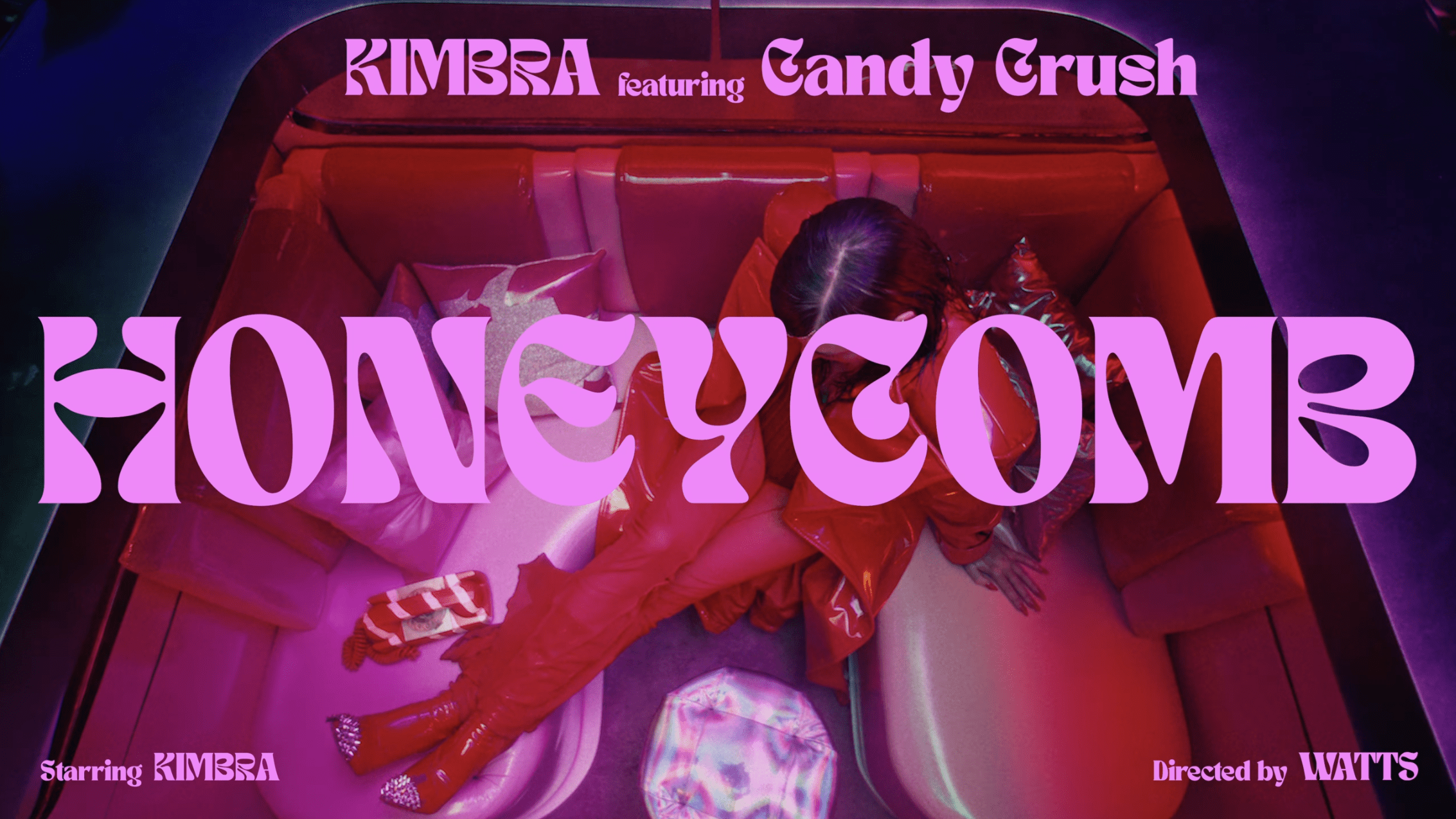
Colour grading for fantasy and sci-fi projects presents unique challenges, but it also allows for a lot of creative freedom. When I’m working on projects like the recent Candy Crush campaign, I can push the boundaries creatively, though there are still limits to consider. If you go too far, the audience can start to feel that the visuals have been overly manipulated, and it can take them out of the story. I always aim to keep a foot in reality, starting with how the scene was filmed—the lighting and the natural look—and then expand from there to create something more otherworldly. The key is finding that balance between fantasy and believability so the audience can experience something new while staying emotionally connected to the narrative.
In contrast, the approach is more constrained when I’m grading commercial projects. Brands often have specific guidelines, and I need to ensure that the colour grade meets those specifications. The focus shifts to precision, especially with maintaining true, neutral white points and product-specific shades.
For Kimbra’s Candy Crush Video (above), I had the chance to really experiment with deep, rich colours. We wanted to give the grade a more painted quality, like a vibrant matte painting from a classic film. At the same time, we had to keep Candy Crush’s brand palette in mind, which involved working closely with both the directors and the brand team to merge their vision with the established look of the game. One of the fun details we worked on with the grade was enhancing the Easter eggs hidden in the set design, like candy pieces in flowers and signs in the background. It was a great way to tie everything back to the game.
Check out the full article HERE.